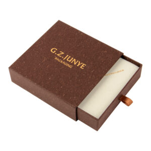
What the Colour Split Signals Before the Box Opens
Two tone jewelry box contrast is a design decision made before a single piece of jewellery is seen. A buyer meeting the closed box reads the colour split first, and the split tells them whether the case is meant to be quiet or loud. A bright yellow sleeve with a near-black face says the box is meant to be noticed, which suits the jewellery packaging brief where the box has to work on a counter and in a photograph.
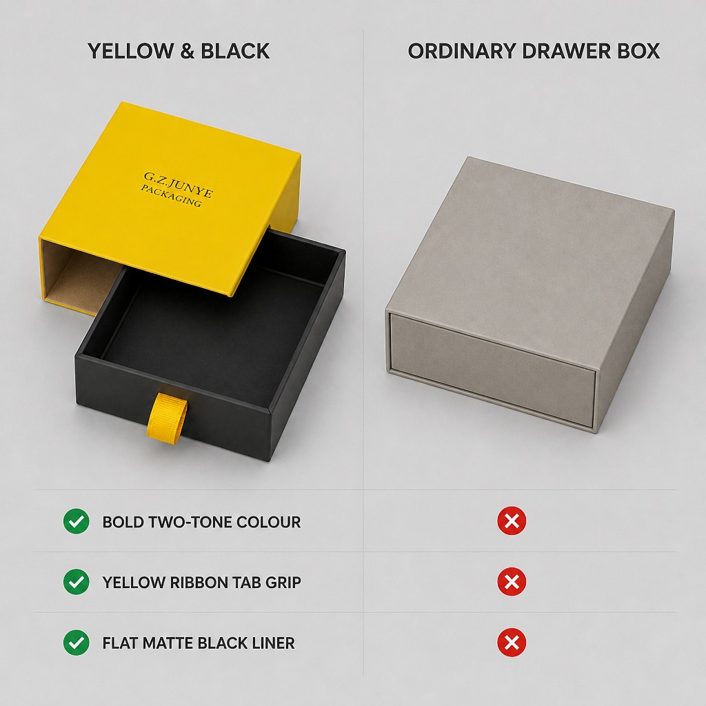
| Surface | Colour | What the eye reads |
|---|---|---|
| Sleeve outer face | Bright yellow matte | The box as a whole |
| Sleeve inner wall | Kraft, bare board | A natural lining, not a print |
| Tray outer faces | Near-black matte | A dark core inside a bright frame |
| Tray floor pad | Slightly lighter matte black | A laid-in pad with a visible margin |
Yellow Outside, Kraft Inside: Where the Contrast Stops
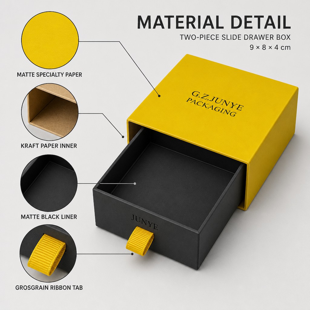
The yellow stops at the sleeve, and the sleeve is not yellow all the way through. Its outer face is matte specialty paper; the inner wall is bare kraft board left unprinted. Pull the tray out and the second colour appears, which is the difference between printing a box in two colours and building it from two colour decisions.
A Near-Black Tray and the Yellow Ring That Frames It
The tray is near-black outside and matte black inside, and because the sleeve is open at both ends its edge band shows as a thin yellow ring around the drawer face when the box is closed. That ring is the whole framing device. Make it uneven and the closed box looks out of square; make it even and the black face reads as a deliberate panel.
Why a Ribbon Tab Stitched Flat Reads as Intentional
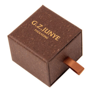
The pull on this case is a short yellow grosgrain ribbon tab, stitched flat at the centre of the drawer face. Because the tab is soft and flat, it adds no hardware and no weight, and because it is grosgrain, the ribbed surface keeps the tab looking like a textile rather than a strip of paper. A ribbon jewelry box often uses a tied knot; here the same family of material is used flat, as a grip.
| Tab detail | This case |
|---|---|
| Material | Grosgrain ribbon, yellow |
| Width | Short tab, sized to the 9 x 8 x 4 cm face |
| Position | Stitched flat at the centre of the drawer face |
| Feel | Soft pull, no metal and no ring |
| Colour | Matched to the sleeve, not to the tray |
How Much Black a Flat Liner Needs to Look Black
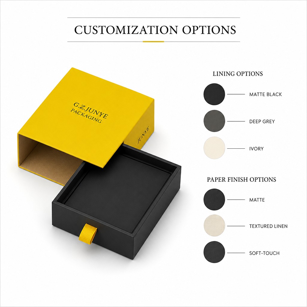
The tray floor is flat and matte, with no grooves and no dividers, and inside it sits a separate floor pad in a slightly lighter black, inlaid with a 2-3 mm margin all round. That thin border does the work: it separates two blacks so the lining looks placed rather than poured in. A flat floor is also the flexible one, since a bracelet, a chain or a set all use the same surface.
Depth Against Contrast: What 4 cm Buys
The case measures 9 x 8 x 4 cm, so the tray is shallow relative to its footprint. Against a strong colour split, that shallow tray matters more than it would on a plain box: at 4 cm deep the jewellery sits close to the top edge, the black floor stays visible, and the contrast between the dark tray and the yellow sleeve is not lost in shadow. A deeper box would hide both the pad and the colour.
| Piece | Floor treatment | Why |
|---|---|---|
| Necklace | Flat pad | A chain laid over the pad stays visible at 4 cm deep |
| Bracelet | Flat pad | The piece sits up rather than sinking |
| Ring row | Slot row | Each ring is held apart and stands upright |
| Studs | Paired wells | Two pieces stay together in one place |
Two Ways a Two Tone Box Goes Wrong
Two tone cases fail in two predictable ways, and neither is a printing fault.
Wrong way one: treating the inner face as an afterthought
The inner wall of the sleeve is seen every time the tray comes out. Leave it as an unfinished print surface and the second colour looks accidental rather than chosen; leave it as kraft and it reads as a material decision. The difference is made at sampling, not at the press.
Wrong way two: matching the two colours too closely
If the sleeve and the tray are tones of the same colour the split disappears at a distance and the box reads as plain. The pairing has to hold at counter distance, which usually means one light colour and one dark, not two mid tones.
When a Single Colour Still Wins
A two tone case is not always the right answer. If the jewellery itself is the loud element, or the range runs several brands through one carton plan, a single colour keeps the box neutral and the shelf quiet. The same structure can be ordered in one colour, and flat box proportions are set by the tray rather than by the colouring, so nothing else about the case changes. The FAQ covers what a two colour run needs at sampling.