The color coordination of Jewelry Packaging Boxes typically needs to reflect the brand’s tone, product positioning, and consumers’ aesthetic preferences, while conveying a sense of luxury, elegance, or modernity through jewelry box design. Here are common color matching schemes and design ideas for jewelry paper packaging:
First, modern jewelry box design contrast color
1. Red + Black
features: Strong visual impact, red symbolizes passion and celebration, black balances the sense of heaviness.
Suitable scenarios: Holiday limited editions, Chinese style designs (such as jadeite, Hetian jade).
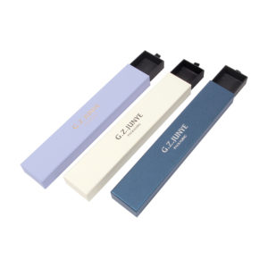
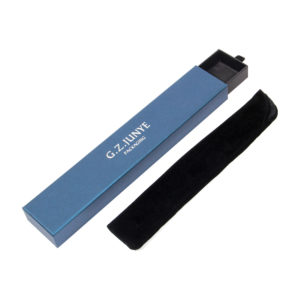
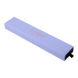
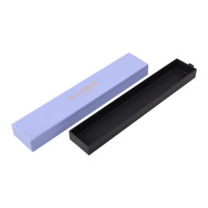
2. Powder + Gold
features: Feminine and romantic style, light pink combined with rose gold exudes gentleness.
Suitable for: Girly jewelry, Valentine’s Day gift boxes, and luxury fashion brands.
6-300x300.jpg)
3. Color clash design (such as blue + orange, purple + yellow)
features: Attracts a young demographic, suitable for trendy brands or fast fashion jewelry.
Techniques: Reduce saturation to avoid a cheap look, use locally (such as box lining or ribbons).
8-300x300.jpg)
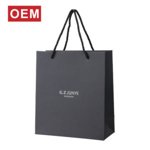
Second. Jewelry Box Design Considerations
1. Brand Consistency: The packaging color must be coordinated with the brand’s VI (such as LOGO, store design).
11-300x300.jpg)
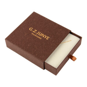
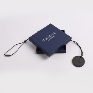
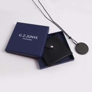
2.Consumer Groups:
Female: Soft pink, purple, champagne colors
Male: Dark gray, navy blue, black
Young market: Macaron colors, gradient effects
Environmental Trend: When using recyclable materials, natural colors (off-white, light brown) are more effective in conveying the concept of environmental friendliness.
7-300x300.jpg)
Combining color psychology and brand positioning in jewelry box design not only enhances the value of the product but also strengthens the emotional connection with consumers.